
CONTENTS
How To Use A Color Wheel: Transforming Spaces with Confidence
Do you want to give your home a new, lively look? To make sure that your inside decorations look attractive and balanced, it is essential to understand and put to good use the color wheel.
This helpful tool can make it simple for you to pick out hues that go together and form impressive visuals. In this article, we will explore the world of color theory while teaching you how to use a color wheel just like an experienced interior designer would change up your living room or other rooms.
Let’s go!
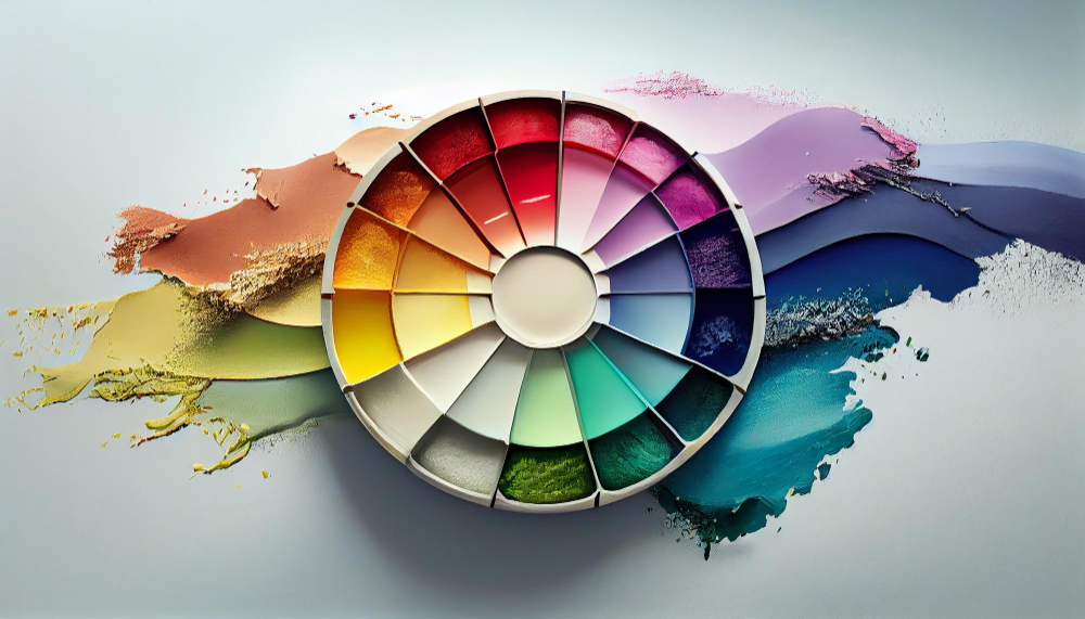
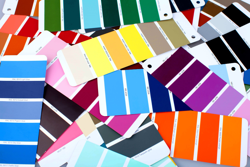
The Color Wheel and How It Works
Before we start talking about how we use colors, let’s first understand the basics. Color wheels are like circular maps for colors. They show us where colors come from and how they work together.
There are two main types of colors: primary colors (like red, blue, and yellow) and secondary colors (like green, orange, and purple). Color wheels help us see how these colors mix and match.
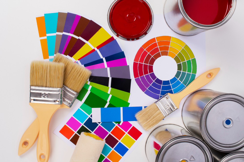
How to Use the Color Wheel to Build Color Schemes
Combining different colors might be difficult for some people, but you don’t need to worry. Read our article below to learn how to use a color wheel.
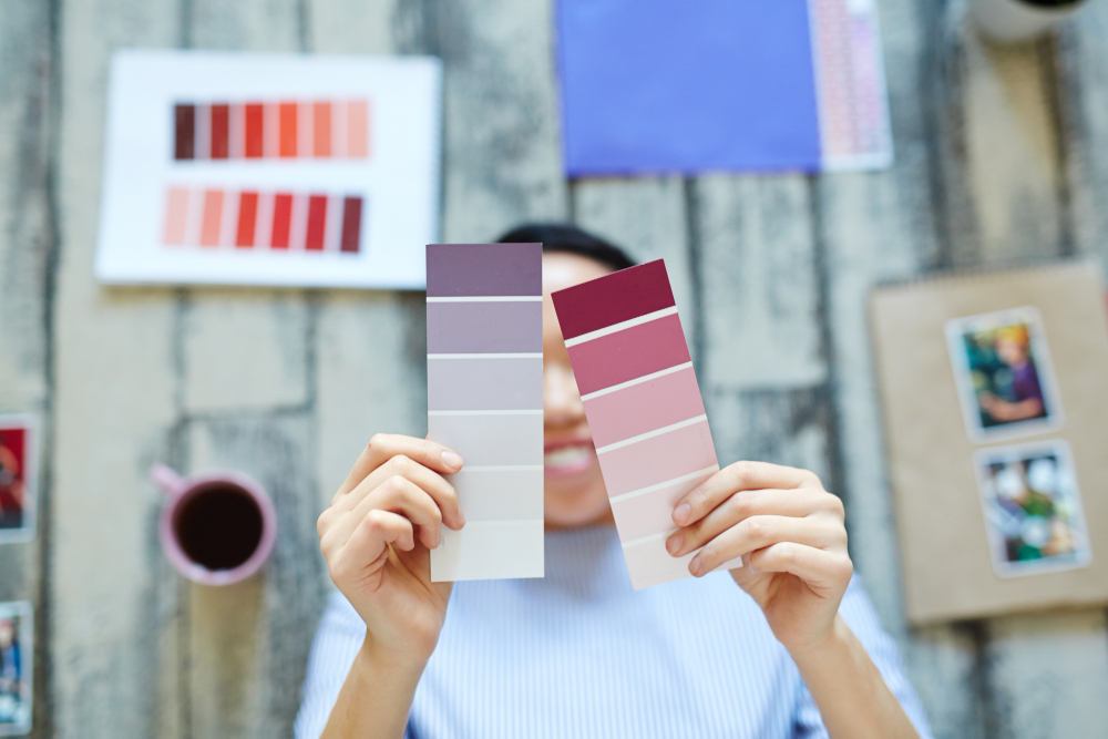
Monochromatic Colors
Different from primary and secondary colors, crafting a graceful and harmonious color combination can be effortlessly achieved by applying monochromatic color schemes.
This method entails handpicking various tints, shades, and tones, all derived from a single base color. For example, blending diverse hues of blue – ranging from deep navy to delicate sky blue – can yield an atmosphere that exudes tranquility and refinement.
Analogous Colors

Within a color palette, analogous colors gracefully reside beside each other on the color wheel. These colors stem from a shared primary hue, resulting in an inherently pleasing combination.
For instance, when you blend different tones of yellow and green, it evokes a feeling of calmness and a connection to nature. This makes it an ideal choice for a room designed for relaxation and serenity, like a bedroom, following an analogous color scheme.
Complementary Colors
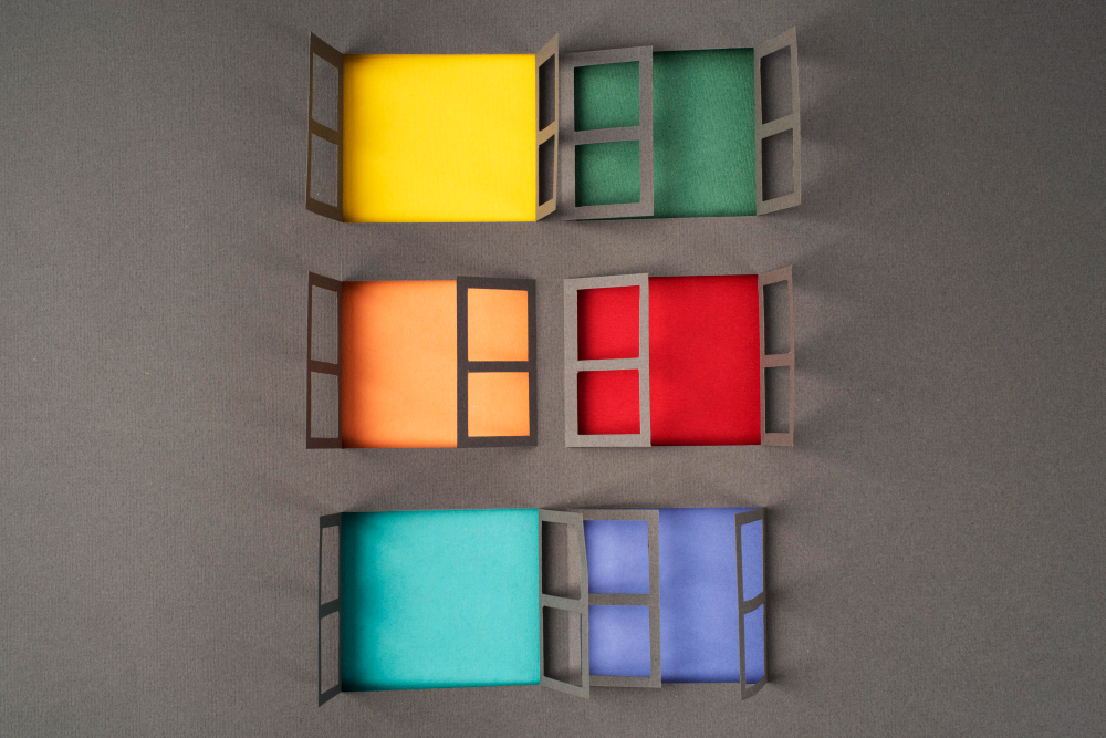
Complementary colors are like opposites on the color wheel. When you put them together, they make a strong contrast, making a room feel lively and energetic. For example, you can pair deep greens with rich reds or bright yellows with vibrant purples to create a bold and attention-grabbing look
Triad Color Scheme

The triadic color scheme is about picking three evenly spread colors on the color wheel. This method gives a balanced and lively appearance. Think of blending primary colors like blue, red, and yellow in just the right amounts. This mix creates a visually exciting and vibrant feeling in a space
Tetradic Color Schemes
If you love having many different colors, the tetradic color scheme could be perfect. With this scheme, you pick two pairs of opposite colors on the color wheel. This gives you a palette that’s full of richness and variety. When you balance everything just right, it can make a room look nice and lively, following a tetradic color scheme.
Split-complementary Color Schemes
A softer way to use colors together is the split-complementary scheme. Instead of using a color’s exact opposite, you pick the two colors next to it on the color wheel.
For example, instead of the exact opposite of red, you could use colors like blue-green and yellow-orange, or red with yellow-green. This gives a nice blend that’s not too different, making things look balanced and harmonious.
Frequently Asked Questions
What is the 3 color rule in interior design?
The 3 color rule is a guideline that suggests using three primary colors in a room’s design. One color should dominate, another should support, and the third should accent. This creates a well-balanced and visually appealing space.
What is the 80 20 rule in decorating?
The 80-20 rule, also known as the Pareto principle, suggests that 80% of the effects come from 20% of the causes. In decorating, this means that 80% of the visual impact is achieved through 20% of the design elements. Focus on those key elements for maximum effect.
What colors go together?
Colors that are next-door neighbors on the color wheel, like analogous colors, usually look good together. On the other hand, warm colors, which are opposites, make a strong contrast. It’s important to think about the feelings and atmosphere you want to make when you pick your color combinations.
Conclusion
In the interesting realm of interior design, the color wheel is your go-to resource. You can transform typical rooms into dazzling creations by knowing the connection between warm and cool colors and experimenting with different combinations.
Let the color wheel stimulate your artistic abilities and guide you in how to use a color wheel to create harmonious room designs, thereby increasing your home’s value.