
CONTENTS
Interior and Exterior Hues: Best Color Combinations for Your House
In the world of home design, color is king. It is the heartbeat of every room, dictating the vibe, mood, and overall aesthetic of the space. Are you planning to spruce up your space with new hues? You’ve come to the right place.
Ahead, we’ll guide you through the best color combinations for both your interior and exterior spaces. Prepare to transform your living space into a masterpiece that reflects your personality and style. Read on!
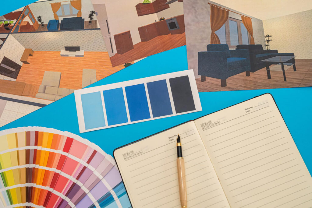
Top Interior Color Combinations
Here are our carefully selected color combinations based on current trends, timeless appeal, and expert opinions in the interior design world. Check them out!
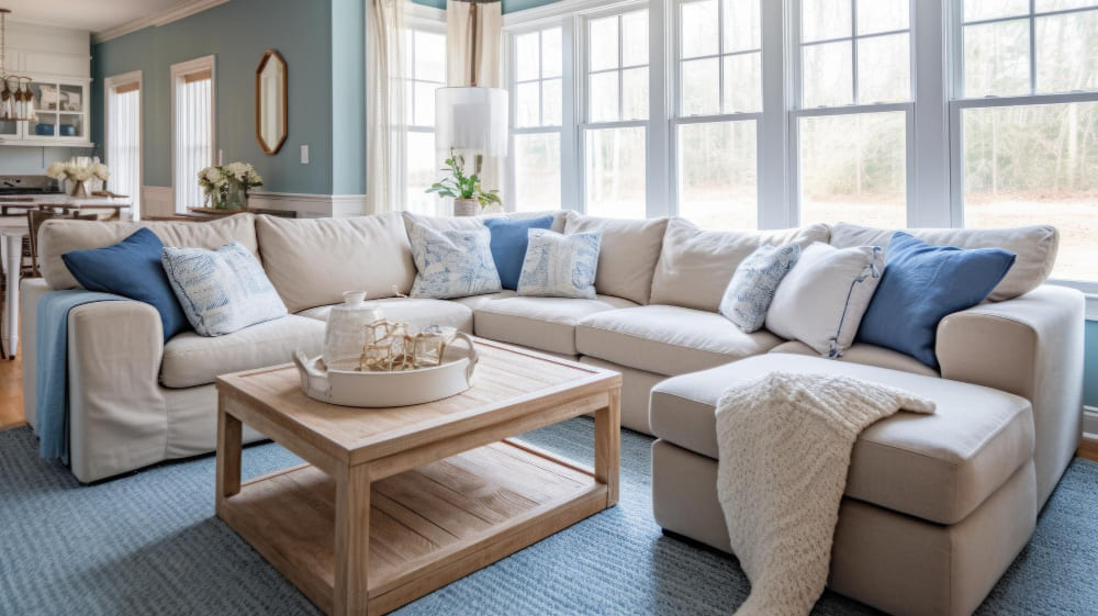
Gray + Sand + Blue
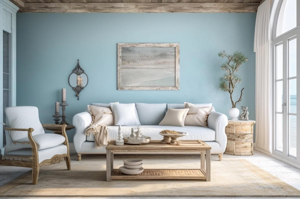
Want a calming palette for a coastal-vibe room? Try these gray + sand + blue combination. While gray provides a sophisticated, adaptable backdrop, the sand adds warmth and an earthy touch.
On top of that, shades of blue bring in tranquility and a refreshing contrast that breaks up the neutrality of gray and sand, especially in softer shades like powder or sky blue. Together, these colors create a soothing, balanced environment suitable for relaxing spaces.
White + Pops of Color
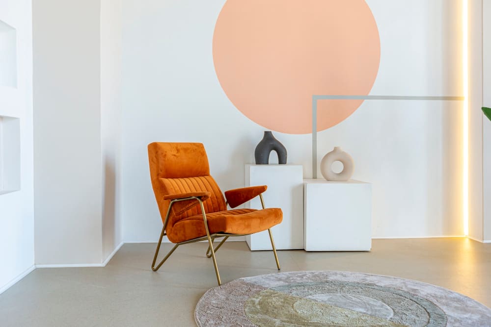
Paint your own canvas in a classic yet dynamic approach with white and pops of color combinations. White walls serve as a clean, bright canvas that enhances natural light and creates a sense of spaciousness. To spice up the look, you can add furniture of various colors, whether vibrant or muted or even some patterns to add flair.
This color combination adds personality and interest, breaking the monotony of white and making the space more engaging. Moreover, it allows for endless customization, as you can easily switch out colors according to mood or season. However, be careful in choosing the color combination, as the details may get chaotic.
Light Blue + Emerald
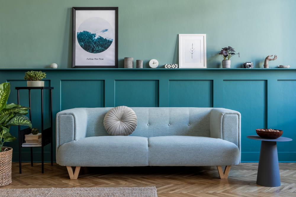
Emerald, a rich and deep shade of green, serves as a serene and airy base, evoking a touch of luxury and depth. Combined with soft light blue furniture, it adds a sky or ocean vibe, bringing life and energy to the room. This color palette elegantly balances tranquility with sophistication, creating a visually captivating and relaxing environment.
Blue + Beige
A harmonious blend of warm and cool tones? Of course, you can get it! Try this stunning combo of blue and beige. Blue, often associated with calmness and depth, provides a soothing backdrop. Meanwhile, beige, with a neutral earthy tone, adds warmth and versatility to the space. Together, they create a balanced and inviting atmosphere, ideal for both modern and traditional interiors, especially for a study or office.
Black + Navy
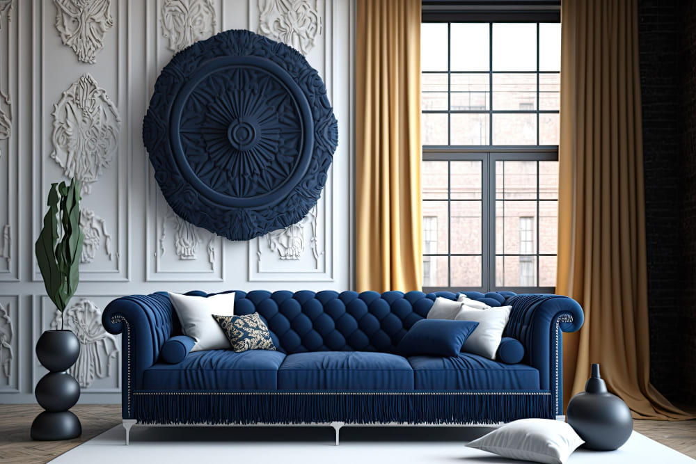
Do you prefer a bold, sophisticated look? Try this black and navy color combination. This duo creates a luxurious and modern ambiance, perfect for spaces where you want to create an air of refinement and mystery.
Black, known for its dramatic and timeless appeal, gives depth and grounding to the space. As a combo, navy, a deep shade of blue, adds a sense of richness and elegance without being too overpowering. You can add white to some sides of the walls so the room won’t be too dark. The result? A room that exudes masculine energy!
Top Exterior Color Combinations
Besides interior color combinations, you also need to pay attention to exterior color combinations as they may affect people’s first impression of your living space. Here are our top picks.
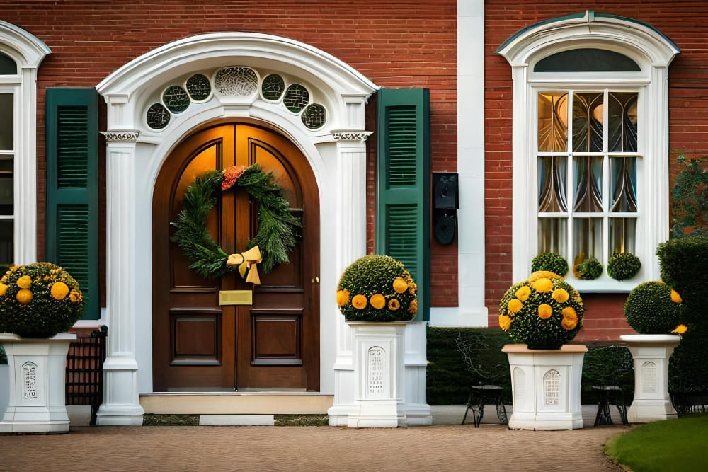
Red + White + Blue + Beige
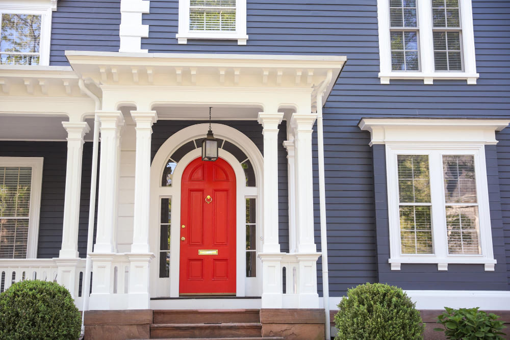
A bright red serves as a bold accent when applied to the front door and its jambs. In addition, paint the window jambs and jamb casing white and beige to provide a clean, crisp contrast while bringing warmth and balance. As for the walls, opt for light blue to add richness or vibrancy while keeping it lowkey. Together, they create a striking yet harmonious exterior.
Lavender + White + Purple
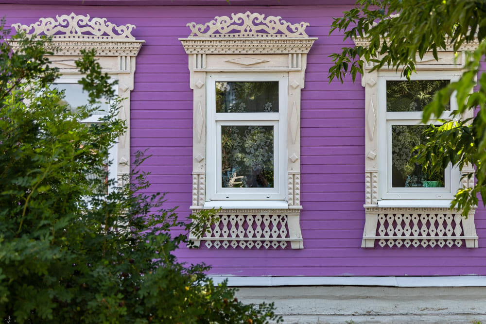
Want an exterior that exudes delicate, feminine energy? Opt for these shades of purple. Lavender, a soft and calming shade, can be used as the main color to give your home a distinctive and charming appearance. White can serve as a crisp accent color, highlighting architectural details or trim for a clean, fresh look. To provide a beautiful contrast, use purple sparingly on elements like the front door or window shutters.
Cocoa + Olive + Off-White + Russet
Blend with natural surroundings with these earthy color combinations. Cocoa, a rich, deep brown, can serve as the main color, providing a strong and warm base reminiscent of nature and wood. Combined with olive for trim or accents, it complements the cocoa while adding some diversity to the color scheme.
In addition, off-white can be used to highlight architectural details without creating too harsh of a contrast. To top it off, use russet sparingly on the front door or window frames to add a bit of warmth and spice, creating an interesting visual focal point.
Iron Gray + Arctic White
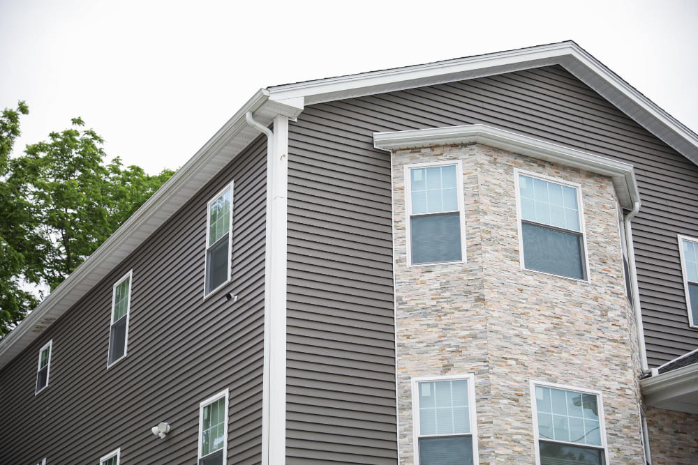
Give your house a contemporary feel that pairs well with minimalist or modern architectural styles using iron gray as the main shade for your home’s exterior. Combined with arctic white that highlights architectural details, such as trim, molding, or window frames, it creates a sleek, polished exterior that is both striking and timeless. Perfect for those seeking a chic aesthetic for their home’s exterior!
Sage Green + Cream + Yellow
Add a sense of bright, welcoming, and harmonious choice that’s perfect for giving your home a cheerful and inviting appearance. It’s especially suitable for cottage-style or country-style homes.
With sage green roofing, you’ll provide a natural feel that can beautifully blend your home with its surroundings. Opt for cream for the wall color and yellow for elements like the front door, window frames, or shutters to add a pop of brightness and cheerfulness. Or, you can always switch the color combination for different house elements.
Frequently Asked Questions
Why is an interior color scheme so important?
An interior color scheme is important as it sets the mood, affects perception, influences emotions, enhances aesthetics, creates harmony, reflects style, and transforms spaces.
How to choose an interior color scheme for your home?
Choose colors based on personal style, room size, and lighting. Create a flow, pick a dominant color, add accents for contrast, consider emotions, test paint samples, seek inspiration, and think about timelessness.
What is the three-color rule in interior design?
The “3-color rule” in interior design is a guideline that suggests using three different colors—one primary and two complementaries—in a room’s color scheme to create visual interest and balance.
Conclusion
Choosing the right color combinations for your home’s interior and exterior can significantly enhance its aesthetic appeal and create a welcoming atmosphere. Remember, the perfect color scheme is not just about following trends, but it’s about reflecting your personality and enhancing your home’s architectural features.
Experiment with different hues, consider the emotional impact of colors and don’t forget about the importance of lighting and room size when choosing your palette.
So, embark on this colorful journey and transform your house into a home that not only stands out but also tells your story. After all, a well-painted home is a well-loved home!